The Art of the Handoff: Responsive Specification
Responsive Logic
Breakpoint Definition
Developer Handoff
Loom
Confluence

Incomplete Specifications
Previous handoffs often provide only the "perfect" desktop view. This leaves engineers guessing about mobile behaviour, edge cases, and overflow logic, resulting in unnecessary technical debt and frustration.
Defining the Behaviour
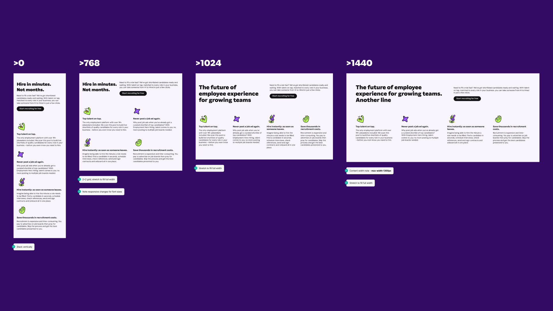
My goal was to remove guesswork. I needed to create self-documenting logic maps within the developer-ready files, defining responsive rules for every viewport from 1920px down to 375px.
Complex Data Adaptation
Adapting complex grids like the Pricing Matrix for mobile isn't just about stacking boxes. It requires strict logic—hiding columns, transforming tables into cards, and scaling typography—which had to be explicitly documented.

The "Impossible" Table
The Employment Hero Pricing Matrix was the ultimate stress test for responsive handoff. A 100-row table simply doesn't fit on mobile.Instead of just designing the "Before" and "After," I embedded the Transformation Logic:
Clearly marked at what pixel width (e.g., 768px) the layout switches.


The Fluid Grid
For the EmploymentOS Website Overhaul, I needed to ensure the modular content blocks looked great on any screen, not just specific breakpoints.
Specified which elements should stretch to fill the container and which should remain fixed width.


Self-Documenting Workflows
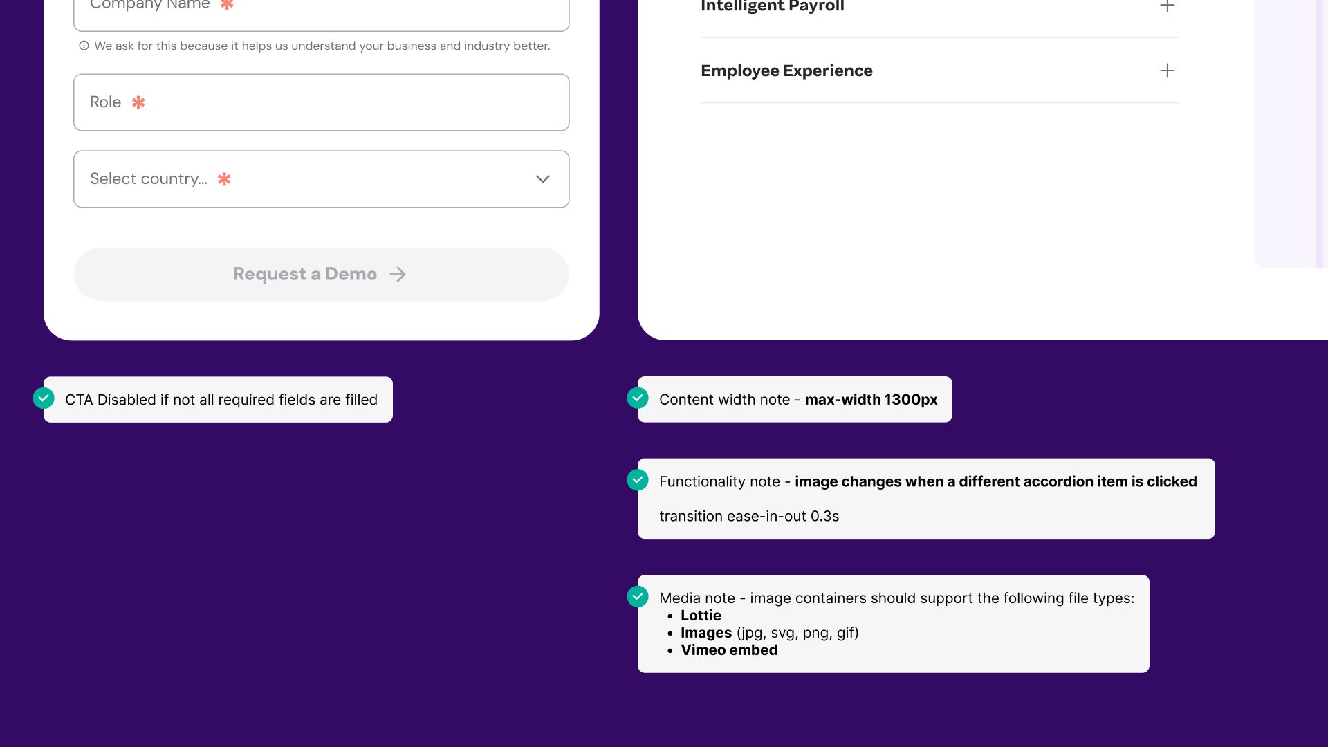
The best documentation lives where the work is. I added annotation components to make the Figma canvas self-documenting.

