Reducing Decision Fatigue in Complex SaaS Pricing
Information Architecture & Responsive Web Design
Component Design
UI/UX
Information Architecture

The Problem: 100+ Features, 3 Plans. Decision paralysis.
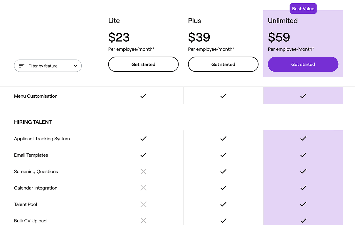
Employment Hero offers a comprehensive suite of tools ranging from Hiring, HR, Payroll, and Benefits. The data set required to compare these plans includes over 100 distinct line items. The existing solution suffered from analysis paralysis. Users were presented with an endless wall of checkmarks, making it difficult to identify value differentiators between the 'Plus' and 'Unlimited' tiers.
The Goal:Transform a relatively raw data spreadsheet into a Decision Engine that guides the user to the right plan without hiding complexity.
The old pricing comparison table


Mirroring the Website Information Architecture
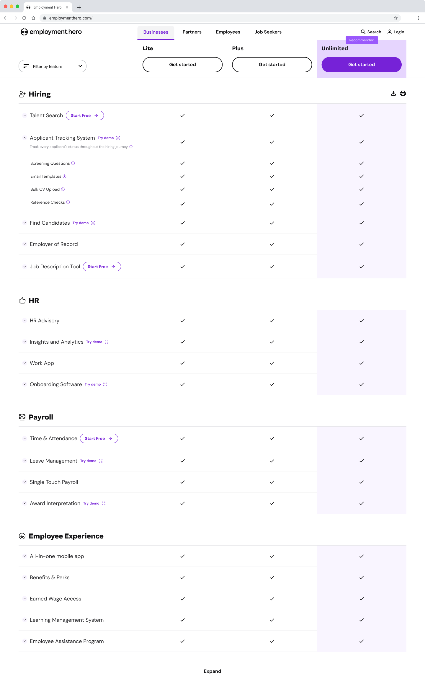
The previous table suffered from over-simplification. It listed specific capabilities directly under broad categories. These did not communicate that these are actually components of a larger, specific module.
The strategy was to introduce a 3-Level Taxonomy, reorganising the table to reflect the true depth of the product, nesting items to show ownership
Instead of a flat list, users now see a clear map of the ecosystem, understanding exactly which Feature provides the Capability they need.


The High-Fidelity Comparison Matrix
The plan names and pricing stick to the top of the viewport. Context is never lost.


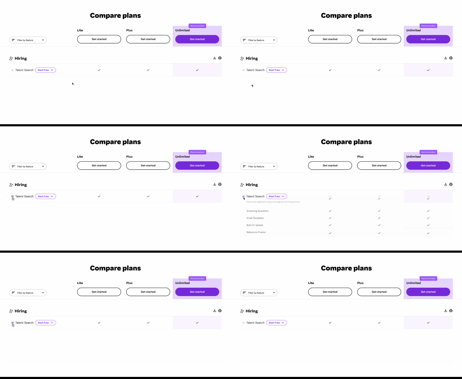
Managing Density via Progressive Disclosure
Displaying 100+ granular capabilities (Level 3) by default created a "wall of text" that forced users to scroll endlessly. To solve this, I implemented an accordion interaction model. Specific capabilities remain collapsed under their Core Feature (Level 2) by default.
This respects the user's attention bandwidth. Users can scan the high-level value quickly and only expand the specific capabilities relevant to their needs.


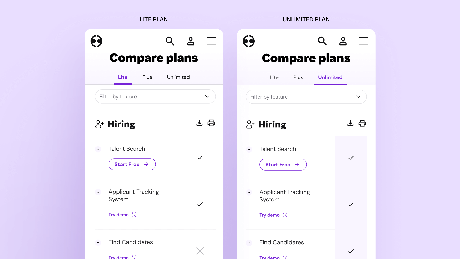
Solving the 4-Column Mobile Problem
A common failure in complex table design is shrinking the content until it's unreadable on mobile.
Instead, I designed a Sticky Tab Pattern. The first column remains locked, while the user can toggle the "View" column between Lite, Plus, and Unlimited. This allows for focused, 1-to-1 comparison on narrow screens.


Built for Scale
Employment Hero is a fast-growing product, so the design needed to support rapid content updates.
I architected the table using strict Auto-Layout and component properties that mirror CSS Flexbox logic. This ensures that if a 4th plan is introduced or a feature description wraps to three lines, the grid adapts automatically without breaking visual alignment or requiring a code refactor.


The Impact
This redesign moves the user from "data overload" to "confident decision." By respecting the user's cognitive load and strictly organising the information architecture, the pricing page becomes a navigable decision engine. By structuring data around user needs, we reduced decision fatigue and increased high-tier plan adoption, proving that clarity drives conversion.
