
Designing For Trust: High-Conversion Forms
Form Logic
Mobile Optimisation
CRO
Micro-interactions & Data Validation
Visual Redundancy
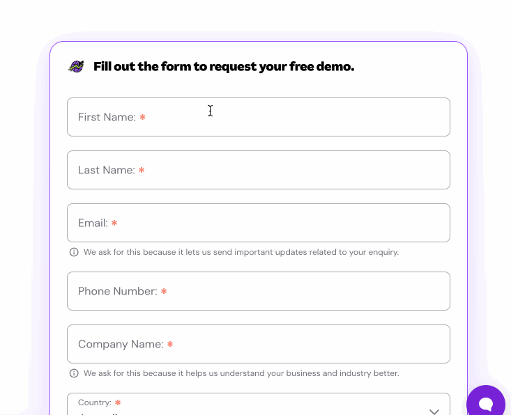
By displaying both a static Field Label and placeholder text simultaneously, we forced users to process two layers of text for every input. This created visual noise, making the form feel denser than it needed to be.
Optimising the Lead Capture Experience
I needed to redesign the input experience for high-value touch points (Book a Demo, Gated Content). The goal was to create a "conversation, not an interrogation"—guiding the user through the process with clear visual cues and forgiving logic.
Mobile Constraints
The challenge was to pack complex validation logic and label animations into a touch-friendly UI. We needed to transform a desktop-centric layout into a fluid mobile experience that worked flawlessly on a 375px screen without sacrificing data quality.

Efficiency via Floating Labels
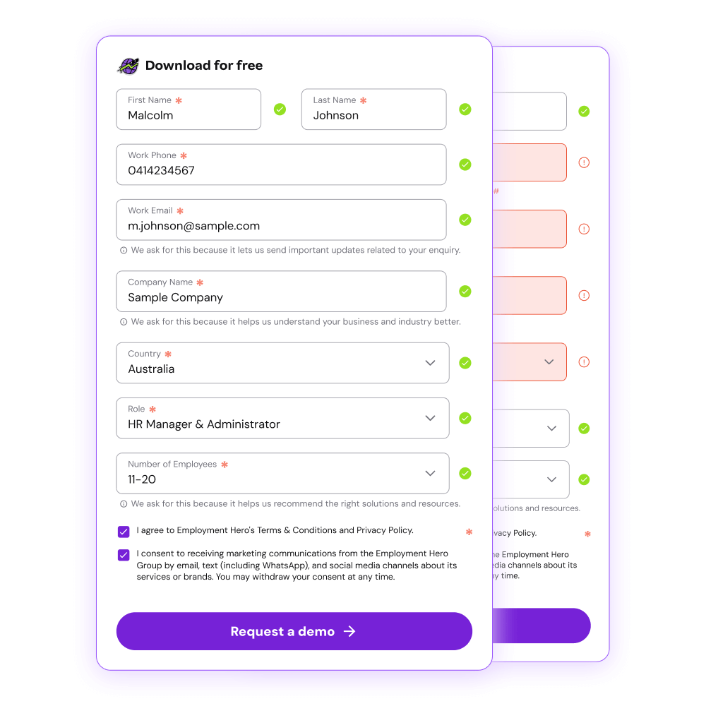
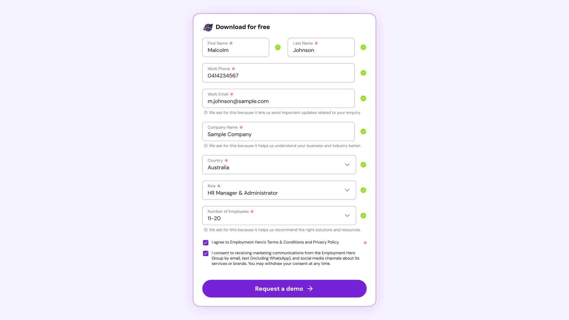
To solve the redundancy issue without sacrificing clarity, I implemented the Floating Label Pattern (Material Design style). This pattern merges the Label and the Placeholder into a single element. When the user activates the field, the text animates upward to become a persistent label.

Positive Reinforcement
Error messages cause anxiety. I flipped the script to focus on Success States. Instead of only shouting when things went wrong, I added Positive Validation Logic. When a user enters a correct phone format or a valid email syntax, a green checkmark instantly appears.
This micro-interaction gives the user a dopamine hit of reassurance, confirming "You are doing this right," which keeps them moving forward.

Thumb-First Design
The 466% increase in conversion was primarily driven by fixing the basic usability flaws that plagued mobile users. I rebuilt the inputs with a "Mobile First" mentality:
Increased input height to 48px min-height for error-free tapping.
@ layout).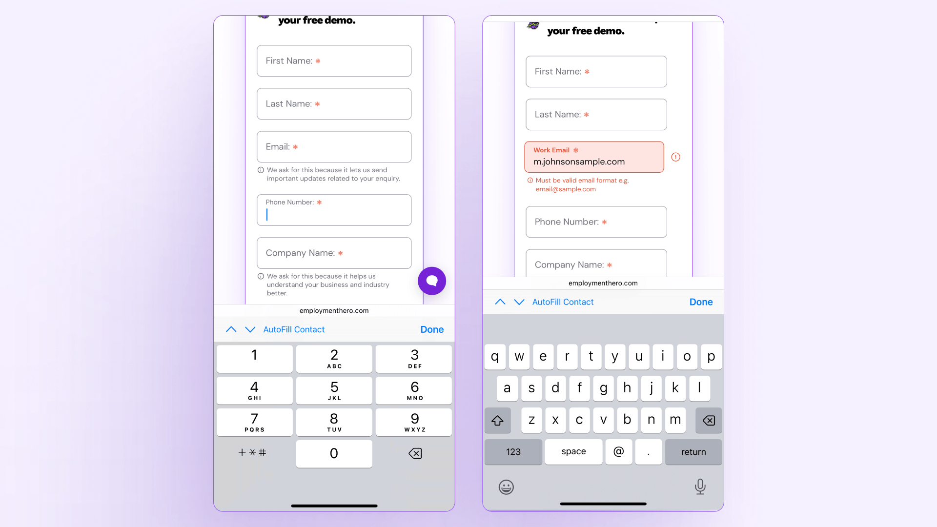

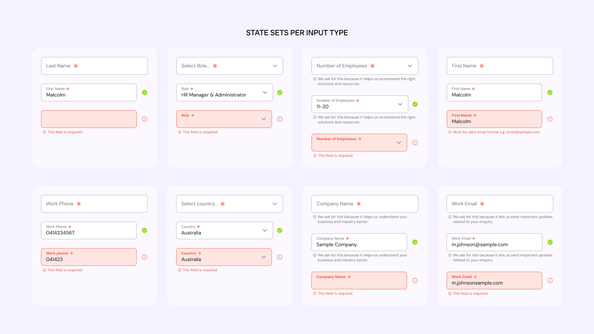
Codifying the States
To ensure these patterns adhered to our new Design System, I designed State Sets. I expanded the component library to include comprehensive variants for every input type. This ensures that any engineer building a new form has immediate access to the full logic suite, not just the "Default" view.

The Outcome
By moving from passive inputs to active, validating interactions, we removed ambiguity and turned mobile into a high-performing conversion path.